-
English


LED letter displays can turn a simple word, logo, or building sign into a dynamic digital feature. But there is one design problem that is easy to underestimate: how narrow can the letter strokes become before people can no longer read the shape clearly?
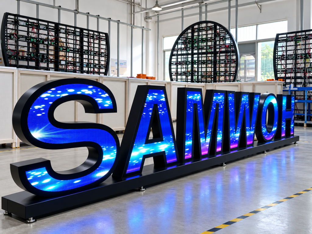
Making a letter thinner can create a cleaner and more elegant appearance. However, an LED display is built from physical pixels. Once a stroke becomes too narrow, there may not be enough pixels to reproduce its edges, curves, and spacing correctly.
There is therefore no single minimum width that works for every LED letter display. The correct limit depends mainly on pixel pitch, viewing distance, letter style, and the physical LED structure.
A printed letter can use extremely thin lines because ink can reproduce small details continuously.
An LED screen works differently.
Every part of the letter has to be represented by individual LED pixels. For example, if a letter stroke is only 20 mm wide and the display uses a P5 pixel pitch, only about four pixels are available across that stroke.
That may be enough to create a visible line, but it gives very little room for shaping curves or diagonal edges.
Letters such as I, T, H, E, and L are relatively simple. Letters such as S, R, G, B, M, and W normally need more horizontal and diagonal detail.
This means two letters with the same physical width may have very different readability.
Pixel pitch should be checked before deciding the final stroke width.
A simple calculation is:
Pixels across the stroke = Stroke width ÷ Pixel pitch
Suppose a 30 mm-wide letter stroke uses P2.5 LEDs.
30 ÷ 2.5 = 12 pixels
Twelve pixels provide much more design freedom than the same stroke using P5:
30 ÷ 5 = 6 pixels
The physical letter has not changed, but the available digital resolution has been cut in half.
For this reason, asking only for the minimum millimeter width is not enough. Engineers should also calculate how many real pixels will exist across the narrowest section.
As a practical design approach, very thin areas with only a few pixels across them should be treated carefully, especially where curves, diagonal lines, or internal openings are involved.
The internal spaces of the letter can become a bigger problem than the outer stroke.
Consider letters such as:
A, B, D, O, P, and R.
These letters contain enclosed or partly enclosed spaces. If the overall letter becomes too narrow, these openings may almost disappear.
For example, a small digital “B” may begin to look like a solid block when viewed from a distance.
Spacing between letters matters as well.
Even when every individual letter is readable, placing several narrow LED letters too close together can make the entire word difficult to recognize.
This is why the complete word should be tested rather than approving only one sample letter.
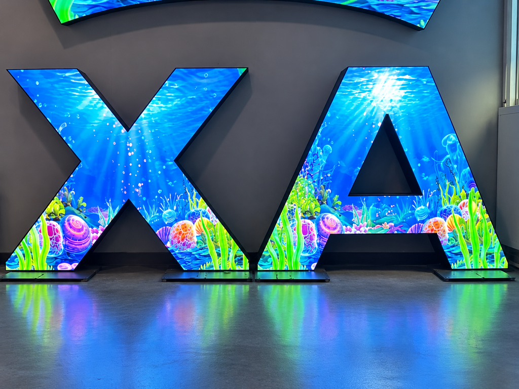
A letter that looks excellent from two meters away may not work from twenty meters away.
At a longer viewing distance, viewers no longer see individual pixels clearly. Their eyes recognize the overall outline of the character instead.
Thin strokes can therefore disappear visually before thicker parts of the letter do.
For a retail counter or exhibition installation viewed at close range, a relatively fine pixel pitch and narrow structure may work well.
For a shopping mall atrium, building lobby, stage, or large public space, stronger strokes may be necessary even if manufacturing a thinner version is technically possible.
The question should therefore not be:
“Can the factory build this width?”
It should be:
“Can the audience still recognize this letter from the intended viewing position?”
Using a smaller pixel pitch can improve the number of pixels available inside a narrow letter, but it does not solve every problem.
A smaller pitch usually means higher pixel density, more components, tighter assembly tolerances, and potentially higher cost.
The supporting frame, power distribution, receiving cards, signal routing, heat dissipation, and maintenance access must still fit inside the letter structure.
This becomes especially important in narrow parts of letters such as the legs of an A, the diagonal section of an N, or the center connection of an H.
The digital shape may be possible while the mechanical structure behind it is not practical.
The best design balances resolution with manufacturability.
For complicated LED letters, a drawing alone is not enough.
The design should first be converted into a real pixel map. Engineers can then check the number and location of LEDs along:
A grayscale or outline preview can help, but a physical prototype is even more useful when the letter is close to the design limit.
The sample should be viewed from the expected installation distance, not only from one meter away on the factory floor.
Testing simple text, logos, moving graphics, and low-brightness content can also reveal whether narrow sections remain visually continuous.
Instead of forcing every part of a logo into exactly the original proportions, small structural adjustments can often improve readability without noticeably changing the visual identity.
Engineers may slightly widen a narrow stroke, enlarge an internal opening, adjust pixel positions, or modify the metal frame behind the LED surface.
For highly customized projects, different sections of the letter may also require different structural solutions.
The goal is not simply to reproduce the drawing at any cost.
The goal is to keep the original visual character while creating a display that is readable, manufacturable, stable, and maintainable.
Imagine a brand wants a 1.5-meter-tall illuminated LED word for a showroom.
Most letters are wide enough, but one part of the logo contains a very narrow diagonal stroke.
If that area is built exactly according to the original graphic, it may contain too few pixels and appear broken from the main customer viewing area.
Instead of changing the entire sign, the manufacturer can slightly increase that stroke width and check the complete word using a pixel simulation.
A small dimensional adjustment can preserve the logo while making the LED version much easier to recognize.
This is often better than discovering the problem after the metal structure and LED modules have already been produced.
No. Minimum practical width depends on pixel pitch, letter geometry, viewing distance, structure, and the type of content being displayed.
Usually it provides more pixels across the same physical width, which can improve shape definition. However, mechanical space, cost, power, heat, and maintenance requirements must also be considered.
Letters with narrow diagonals, tight curves, small internal openings, or complex intersections usually require more attention than simple straight-line characters.
For highly customized or unusually narrow designs, yes. Pixel mapping and physical sampling can reveal readability and structural problems before full production begins.
The narrowest possible LED letter is not determined by one universal number.
A successful design comes from checking stroke width, pixel pitch, pixel count, viewing distance, internal spacing, frame structure, and real-world readability together.
At Toosen, custom-shaped LED displays can be developed according to the geometry and installation requirements of different projects. For unusual LED letters, logos, curves, and other creative shapes, the design should be reviewed from both the visual and structural sides before production.
A few millimeters of adjustment during the design stage can prevent a much larger readability problem after installation.
+86 18688923792
+86-755-23312336
4th Floor, Building B, Zhonghe Building, Taiwan Industrial Zone, 2132 Songbai Road, Shiyan Street, Bao'an District, Shenzhen.


Emall us with any questions or inquiries or use our contact data.We would be happy to answer your questions.
Toosen Professional Manufacturer of led sphere display,led screen globe,led ball display,spheric led screen,spherical led display, Led Special-shaped LED manufacturer, LED factory,Manufacturers & Suppliers,Factory & Exporters. Looking forward to your cooperation.
Copyright © 2010-2026 Toosen LED All Rights Reserved
Theme by WordPress